 Review: Wisconsin Film Festival
The Boy and the World (O Menino e o Mundo) | Alê Abreu | Brazil | 2013 | 80 min
Wisconsin Film Festival, Sundance Cinema 1, Friday April 10, 3:45pm»
Wisconsin Film Festival, Union South Marquee Theater, Saturday, April 11, 1:45pm»
First, I’d like to applaud the Wisconsin Film Festival programmers for committing to international children’s cinema in their “Big Screens, Little Folks” strand. For adults, a festival can help shape the general film culture in the community; and for children, a festival can and should help broaden children’s experience of the media in general and cinema specifically. The Brazillian feature film presented in the strand, Alé Abreu’s The Boy and the World offers some interesting and worthwhile challenges for young viewers for whom animation might be synonymous with cartoons. I’ll try to balance between my own reactions to the film and my thoughts about how rewarding it should be to share the film with young audiences.
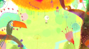
The Boy and the World suggests the subjective experience of a young boy exploring the world around him and by alternating between simple line drawings, complex collages, and pure abstraction. What appears to be a linear narrative turns into an atemporal circular structure, and the ambiguous relationships between the boy and two adults he meets on his journey provide a commentary on the personal consequences of urbanization within capitalism.
I currently work with kids, and when I tried to explain The Boy and The World to a third-grade girl I started by telling her it was animated. She asked what “animated” meant, and I said it was like a cartoon. She replied, “Then say ‘It’s a cartoon.'” Very little of what I’ve said so far would resonate with her, either. That’s probably for the best, because the socio-economic analysis in The Boy and the World is somewhat broad and simplistic even for adult audiences. What should resonate with children is the that the boy longs for the simple rural life he led with his parents before his father had to leave, presumably to find work.
The storytelling is primarily visual without dialogue. Brief passages of dialogue are in Portuguese played back in reverse, so subtitles are not necessary because even Brazilian children would not understand them (this should not be so different for children familiar with the adult dialogue in Charlie Brown animated specials). The simple character designs provide easy access to character emotions through gestures and poses. Simple motifs help guide the viewer, including the visualization of notes coming from the father’s flute which the boy follows hoping to find him.
The success of the Wall-E should remind us that kids are better equipped to understand wordless visual storytelling than we realize. That said, the kids will probably be more interested in the film when the boy maintains some narrative momentum in his search for his father. The search is often interrupted by observations about labor, the means of production, and the evils of an apparent corporate-police state. Kids will understand who the bad guys are, if only from genre conventions, but I’m not sure if they’ll understand why they’re bad with any meaningful nuance.
 Stylistically, the film participates in a tradition that dates back to the UPA Studios in the 1940s (Gerald McBoing Boing, Mr. Magoo) with an emphasis on abstract backgrounds and strong colors. The boy often walks through spatially ambiguous planes of action so we’re never quite sure if he’s going to recede into the background or climb up into the air. Most of the time the planes are flattened against each other, as if shot with a telephoto lens. But even when there’s a suggestion of depth, with a separation between foreground, middle ground, and background, the lack of dimensionality in the objects and figures still emphasizes the flatness of the image.
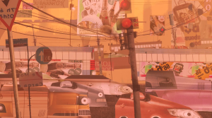
That flatness also reminded me of John Korty’s underrated Twice Upon a Time (1983), not only for its flat figures but also its use of collage elements. When the boy reaches the big city, his sensory overload is represented with cut-out images from popular culture (with words transformed into backwards gobbledygook). Several images in the big city sequence look like Cubist paintings by Fernand Léger.
Personally, I preferred the film when it leaned more towards the abstract and lyrical, and away from the concrete and didactic. I know it sounds trite to say “I liked the colors and the music,” but I did, and I think kids will, too.
The film takes a very interesting turn as the easy to follow linear narrative evolves into something far more complicated and obtuse. This might present a challenge to young viewers, but possibly a rewarding one. A few years ago, it was interesting to take my young nephews and niece to Life of Pi and ask them how they resolved the differences between Pi’s two versions of his story. I learned that kids prefer a definite answer over ambiguity in stories. But that doesn’t mean that kids are not open to thinking about ambiguities and contradictions. I’m not sure if The Boy and the World will inspire in depth conversations with kids about socio-economics, but it should inspire some interesting conversations about how they understood the relationships between the characters. The ending, if you haven’t guessed already, is also very different than Disney endings, so it also offers kids a different kind of emotional experience than they’re probably used to with movies.
The ideal situation would be to watch the film with a smart, curious kid who is open to new experiences. You know, your kid. In fact, I probably deprived myself of a significant part of the experience by watching the film by myself and not discussing it with a child afterwards. Luckily, that could be rectified at one of the two screenings of The Boy and the World at the Wisconsin Film Festival.