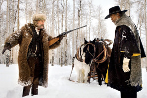
 Review: Theatrical Run
The Hateful Eight | Quentin Tarantino | USA | 2015 | 182 minutes
Now Playing at AMC Fitchburg 18 and Marcus Theaters
James Kreul’s “quick” response to The Hateful Eight and its 70mm roadshow presentation took him 4500 words and one week to write. Note: If you haven’t seen the film, skip the spoilers in the “H8ers Gotta H8” section.
I’ll end this review with some notes on the 70mm presentation at the Music Box Theater in Chicago, where I saw The Hateful Eight on Christmas Day. But I’ll start by saying that I’m surprised to feel obliged to write a quick response to the film (even though this took me a week to write). More often than not, I try to write about films that need more attention when they arrive in Madison, and attention is something that The Hateful Eight decidedly is not lacking. But, for better or for worse, The Hateful Eight compels you to talk about it, so that’s what I’m going to do—at length.
The upshot on the film: Tarantino once again proves that he’s a master of melodramatic affect. The Hateful Eight is smashingly entertaining, and the energy in the theater is palpable as the film pummels middlebrow respectability for three hours. Those who find the film sluggish or boring simply do not appreciate or respect Tarantino’s favorite tactic: the slow burn of a melodramatic tableau. Images seamlessly shift from idyllic tranquility to brutal savagery, often without an opportunity to understand your own response beyond distressed laughter. The performances are fever-pitched and vivacious; the actors eat up the scenery as the characters devour each other.
You can’t deny Tarantino’s ability to foster an audience response. But this time I had mixed feelings about his “everybody’s a hater” approach to racism, misogyny, and homophobia. The title is accurate: all eight are filled with hate, and Tarantino seems to think that equally distributed hate produces an even playing field of moral relativism. The African-American characters, Major Warren and Minnie, hate Mexicans. So that means everyone is prejudiced, therefore everyone is the same, right? Well, no.
I’ll need to describe one important sequence in some detail to to tease out this idea and my response to it, so consider the H8rs Gonna H8 subheading to be a spoiler alert (at that point, skip ahead to the spoiler-free 70mm discussion).
The upshot on the 70mm roadshow: Of course you should see it in Ultra Panavision 70. Why wouldn’t you? But…
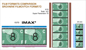
Even though the Music Box installed a new screen bigger than its past 70mm presentations and festivals, one needs to remember that to achieve a 2.76:1 aspect ratio in contemporary theater spaces, the resulting screen will be very wide but not necessarily tall. Those who expect a tall IMAX-style overwhelming image after viewing some Weinstein Company promotional materials might find something very different in many theaters.
Weinstein Company promos make the mistake of emphasizing image size over the importance of image quality and texture. That is understandable, however, because it is easy to sell the former and hard to persuade post-DCP general audiences to see or appreciate the latter.
All You Need is a Girl and a Gun
Using film geek shorthand, there are a couple of ways you could describe The Hateful Eight.
What if Howard Hawks, Monte Hellman, and Sam Peckinpah made a 1970s anti-western shot in 70mm and accompanied by an original score by Ennio Morricone? (Well, that last detail is not a what if, since Morricone did compose the score.)
InThe Hateful Eight, Tarantino both embraces and rejects classical Hollywood in equal measure. Seven men and one woman, regardless of their sins or virtues, subscribe to the Hawksian code of masculine professionalism, albeit a post-modern version with souped-up misogyny, racism, and homophobia. The central plot invites comparisons to Hawks’s jailhouse siege films like Rio Bravo (1959), El Dorado (1966), and Rio Lobo (1970). But despite the overall gloss and texture of the image, I kept thinking about the ultra-low budget psychological westerns by Monte Hellman, especially The Shooting (1966). Tarantino dreams in the Hays Code era, but his nightmares push post-grindhouse hard-R boundaries.
Another way to describe the film would be to foreground the business and showmanship side of the presentation: What if Michael Todd produced a roadshow tour for a grindhouse film, with a world premiere on 42nd Street in 1972?
A “roadshow” was once a studio’s attempt to secure middlebrow respectability for an often maligned mass art form. Tarantino wanted his Grindhouse collaboration with Robert Rodriguez to be an event, but the The Hateful Eight roadshow presentation is truly old fashioned tent-pole event cinema, complete with an opening overture, an intermission, and a 14-page full-color program. You know, all fancy like. But in many of the television ads, when Samuel L. Jackson looks at the camera and says, “Startin’ to see pictures, ain’t ya?”, the pictures his character refers to convey one of the most vile and low brow dick jokes I’ve seen in an American mainstream feature film. So much for middlebrow respectability.
The font shifts in the opening credits are symptomatic of the films generally schizophrenic and often conflicting influences and aspirations. The cast list is presented slowly in a restrained manner that suggests a European influence (I’m confident someone on the internet will discover a direct reference). The Hateful Eight title, however, jarringly appears in a font straight out of 1970s exploitation films. The production crew credits revert to the Tarantino house-style font. From the beginning, Tarantino makes clear that he wants The Hateful Eight to be high art and low art, but most importantly his art.
As a stagecoach attempts to outrun an oncoming blizzard, it approaches a black former Union army major standing next two three dead bodies. He is a bounty hunter, Major Marquis Warren (1. Samuel L. Jackson) who needs help transporting his dead bounty to the next town, Red Rock. Inside the stage, however, another bounty hunter, John Ruth (2. Kurt Russell) is taking the dastardly Daisy Domergue (3. Jennifer Jason Leigh) to Red Rock to hang for a 10,000 bounty. Ruth is known as “The Hangman” because, unlike Major Warren, he brings his prisoners in alive so that they can hang by the neck until dead. Ruth and Warren then encounter Chris Mannix (4. Walton Goggins) who claims to be the next sheriff of Red Rock, but he needs assistance getting there to be sworn in. These encounters slow the stagecoach down, so it must stop to wait out the blizzard at Minnie’s Haberdashery, where most of the remaining action takes place.
They are surprised to find Minnie and Sweet Dave mysteriously absent at the Haberdashery. Bob, a Mexican hired hand (5. Demián Bichir) explains that Minnie is visiting her mother and left him in charge. They instead meet three fellow travelers: Oswaldo Mobray (6. Tim Roth) who introduces himself as the hangman of Red Rock; Joe Gage (7. Michael Madsen) a subdued cowboy writing diary entries, and General Sandy Smithers (8. Bruce Dern), a crotchety old Confederate who is infamous for executing Black prisoners in Union uniforms at the Battle of Baton Rouge. Paranoia, ideologically questionable black comedy, and of course violence ensue. Apart from one misguided extended flashback (Tarantino should have taken a cue from anti-flashback Howard Hawks this time), we have a good old fashioned unity of action, time, and space.
James Parks, son of Tarantino favorite Michael Parks, has a small but important role as O.B., the stagecoach driver. O.B. only hates the cold, and the Haberdashery’s broken front door.
Only two film artists could possibly out-shine Tarantino’s ego here. The first, of course, is Ennio Morrocone, whose alternately brassy and delicate score at times sounds like something you’ve never heard, and at other times provides the spaghetti western call backs (to his own work) that only he could deliver.
The second is Robert Richardson, whose cinematography turns even Minnie’s Haberdashery into an abundance of textures and unexpected highlights. The gentle detail of snow seeping through cracks and delicately floating in one corner provides a surprising degree of relief from the almost endless bickering and tension. But the shining moment for the cinematography—literally—is when Major Warren allows Ruth to see his handwritten letter from none other than Abraham Lincoln during the stagecoach ride. The wonderfully stylized harsh sunlight overwhelms the letter between them and the soft reflection off the paper lights up their faces from below. Perfect.
H8ers Gonna H8
I’m not interested in whether or not Quentin Tarantino is sexist, racist, homophobic, or a hypocrite for his stance against police brutality despite the running joke of prisoner abuse in The Hateful Eight. If he were a more intellectually driven filmmaker instead of gut driven, or if he made coherent ideological claims about his work in general, I suppose I would be obligated to try to address those questions. But he’s not, so I won’t.
All I know is that when a black former military officer gleefully forces a naked white prisoner to suck his cock under fear of death, it means something in 2015 (and now in 2016). That image is not meaningless, even if the event was only a story in the world of the film.
I’m going to try to avoid the problems of oversimplification seen in some discussions of sexism and misogyny in the film. In a perverse twist on old-school Molly Haskell-style “image of women” criticism, Stephanie Zacharek in Time argues that “the more [Daisy] gets hit, the more she grins and cackles, as if she were drawing banshee strength from the abuse—a notion that may seem like misogyny but is in fact its triumphant opposite.” A.O. Scott at The New York Times, on the other hand, seems to have no time to mince words, even though he can’t use some words, concluding, “At a certain point, the n-word gives way to the b-word as the dominant hateful epithet, and The Hateful Eight mutates from an exploration of racial animus into an orgy of elaborately justified misogyny.”
It’s possible that both critics need to be more nuanced, because both try to attribute the film’s ideology to its director. Zacharek’s claim only makes sense in relation to Tarantino’s politics. It certainly doesn’t make any sense in relation to any of the male characters within the film. (Remember: “hateful.”) And Scott seems oblivious to the Hong Kong style tit-for-tat game that seems to be going on throughout a film in which every character is capable of brutal violence—guess what happens to Ruth’s hand that hits Daisy most often? It’s a naive attempt at a level playing field, but it is there.
I also reject Harvey Weinstein’s response to claims of misogyny, quoted in Variety: “If there are cries of misogyny, we will sit down and make them watch Jackie Brown and at the end of the Jackie Brown seminar, they will have to say, ‘Hey, we’re just fishing for stupidity.’” I would find this more persuasive if I sensed that Weinstein had ever sat in a feminist theory seminar on any topic.
So let’s slow down a bit, shift gears, and contemplate a sequence that made my jaw drop. I’ve noticed at least one article that has singled out its importance, but I will read it after I’ve completed this post: “How One Hateful Eight Scene Takes Tarantino’s Tradition of Sexualized Violence to a New Level” by Aisha Harris at Slate. It’s certainly the most memorable and ideologically problematic sequence in The Hateful Eight. Ever the showman, Tarantino punctuates it by placing it just before the intermission.
Major Warren and General Smithers have established their contempt for each other over their respective Civil War atrocities. I’ll need to oversimplify the sequence by not going into detail about Mannix calling bullshit on Warren’s letter from Lincoln, Ruth’s disgust with Warren after finding out the truth, and Warren’s response about why he would need such a letter in the first place, which immediately precedes the Warren/Smithers confrontation. It will have to suffice to say that Major Warren has just been called out for his race. In the subsequent scene the dramatic conflict is simple and direct: Warren places a gun next to Smithers, takes several paces, then begins to taunt Smithers by claiming to be responsible for the death of Smithers’s son, Chester (Craig Stark).
Major Warren begins to paint a vivid mental picture for General Smithers. (This is where the “Startin’ to see pictures, ain’t ya?” line heard in the television ads comes into play.) Whether the story is made up to provoke Smithers or the truth, Warren explains that once he realized that Chester was General Smither’s son, he forced Chester to march naked in the snow for miles until he collapsed. With Chester close to death, Warren offered him a blanket if Chester would perform fellatio on him. Warren teases out this detail in the story with several colloquial descriptions of his genitalia, as the cross cutting between the story and the Haberdashery suggest that Chester sucked Warren’s cock. Afterwards, Warren still refused to give Chester the blanket, and Chester died. When Warren suggests that the only mistake Chester made was to tell Warren that he was General Smithers’s son, Smithers finally grabs and raises the gun but is shot dead by Warren.
I’m not going to tell you what this image means, but I am going to ask you some questions to help you think about what it means.
What does it mean in America, thirteen years after Abu Ghraib, for a (former) military officer to force a naked prisoner to perform sexual acts in what constitutes a semi-comic sequence?
What does it mean to position the viewer to take the side of a torturer and rapist?
What does it mean, in 2016, to play off of various stereotypes about African-American male sexuality in general, and the black penis in particular?
What does it mean, in 2016, to use those stereotypes to convey (and tweak) the anxieties of white Southern conservatives?
What does it mean, in 2016, for the very thought of a son fellating a black man to drive a father to violence?
What does it mean, in the wake of the Black Lives Matter movement, to simply flip the script and portray an African-American with authority who does not seem to think that a particular life matters?
What does it mean, as Barack Obama’s second and final term draws to a close and xenophobic rhetoric dominates the race for the Republican nomination, for an African-American male to tell a good ol’ white boy to suck his cock at the end of a gun and gleefully not give a fuck?
And what does it mean to admit, despite the questions raised above, that I found the sequence audaciously funny, irreverent, and even exhilarating?
It’s not particularly intelligent filmmaking; it’s just touching the buttons associated with the questions above to see what happens. It’s not particularly brave filmmaking; the framing and cutaways suggest fear of the structuring absence: the black penis. It’s not particularly well crafted filmmaking; it is easily the sloppiest in the film in terms of individual image composition and editing rhythm. But you can’t not react to it—and then you react to your reaction.
It’s actually a throwback to pre-cinematic, 19th-century stage melodrama. Despite the cross cutting, conceptually what we have here is an old fashioned melodramatic stage picture, or tableau (“Startin’ to see pictures, ain’t ya?”), which Tarantino extends in duration as long as he can plausibly sustain the tension. Those who are calling the film a “bad stage play” are drawing on the general disdain for theatrical melodrama that has dominated theater criticism since the turn of the 20th century.
One would have to answer all of the questions above, and many more, before approaching what the sequence means. And different people would give very different answers to those questions. So it would be absurd to attribute that multi-faceted and multi-layered meaning to authorial intention. But that doesn’t get Tarantino completely off the hook. At best he’s ignorantly irresponsible; at worst he’s knowingly irresponsible. Again he tries to get out of any moral quandary by resorting to the supposedly level playing field of the narrative’s tit-for-tat structure. Guess where Major Warren gets shot? But in the end the “everybody’s a hater/everybody’s equal/everybody’s punished” stance is a cop out.
How do I account for my exhilaration while watching the sequence? I think one reason to keep watching images is to experience the feeling of not knowing how to respond, because you learn quite a bit about yourself in the process. I admired the outright audacity of the sequence even if I was alarmed by its dubious underlying ideology. I enjoyed having the strings pulled even though I have contempt for the strings. I laughed at the juxtaposition between Major Warren’s (and Samuel L. Jackson’s) menace and glee. I’ve spent the past week questioning my own laughter.
“Twice The Size of What You’re Used To…”
Let’s start the roadshow discussion with the Weinstein Company’s short YouTube video describing the Ultra Panavision 70 experience.
Note that the enlargement of the image is not a comparison of conventional widescreen (1.37:1) or Cinemascope (2.35:1) to Ultra Panavision 70 (2.76:1). Instead, the Ultra Panavision 70 image simply grows larger within the frame. So both the before and after accurately represent the Ultra Panavison 70 ratio, but neither actually compare it to what you might be used to in a conventional theater.
It is possible for an Ultra Panavision 70 projection to be, well, roughly the overall size of what you are used to. It will always be a wider aspect ratio, but the square footage of the projected image, and your impression of its size, will depend on variables such as the distance from the booth to the screen, the lenses used, the overall width available on the screen wall, and, of course, your seat location. And while Tarantino and the Weinstein Company can outfit theaters with 70mm equipment, they can’t rebuild the theaters to retrofit old Cinerama screens.
But this is only a problem if you take the promise of “bigger” as “bigger scale,” or “bigger perceived image.” I think that’s what the YouTube video does, so yeah, I guess it’s potentially a problem for the Weinstein Company. But I have no problem with the roadshow project overall, or individual exhibitors like the Music Box who actually understand image projection aesthetics.
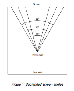
In a white paper on the effect of screen size on sound, Ioan Allen at Dolby Laboratories points out that it is not very useful to talk only about screen size in terms of linear measurements. A 50 foot screen “has no meaning without
reference to theatre size,” Allen explains. He suggests a better measurement of perceived screen size: the subtended angle, or the angular percentage of vision. Allen’s personal interviews with Alex Alden, supervisor of Cinemascope
installations for Twentieth Century Fox, suggest that the after the rise of widescreen cinema, the studios considered the ideal subtended angle as 45 degrees. Anecdotal evidence suggested that theatergoers generally preferred a “prime seat” located two-thirds of the way back from the screen.
Of course, some people sit closer than a subtended angle of 45 degrees, and some people sit farther from the screen. But Allen suggests that studios were keenly aware of the trade offs. Sitting closer to the screen can provide a more immersive experience, but it also lead to distractions away from the story caused by the material properties of the film, like film grain and print scratches. Allen’s “prime seat,” with a 45 degree subtended angle, represents a threshold which maximizes immersion in the image without overwhelming distractions from those physical properties.
I have no idea if this ideal has been supplanted in contemporary post-IMAX practice, or if more recent research has debunked it, but it provides a convenient starting point for this discussion.
As great as the Music Box 70mm presentation was, it fell short of Allen’s ideals. My first impression was: Wow, this screen is small.
My subtended angle seemed smaller than Allen’s suggested 45 degrees, but I was even sitting closer than Allen’s “prime seat.” I sat in the first row of the second section, perhaps one-third of the way back, which I chose for the leg room between sections. The image was plenty wide, just not very tall, and placed higher on the projection wall than I had anticipated. (The front of the auditorium is raked, but I still had to look up at the image.) I was very aware of the space surrounding the image as the film began, and it took a while before I felt completely immersed in the image. The smaller subtended angle in seats further back in the auditorium (even in Allen’s prime seat) must have been even more pronounced.
Why didn’t I just take a picture of the screen from my seat before the film started? Believe me, I’ve been asking myself that question ever since I started writing this post. But I have a feeling that a cellphone snapshot would be misleading without contextual information. Instead, I offer the following Facebook comments in a thread where I attempted to find out whether my impression was shared by others.
Filmmaker and UW-Madison production instructor Aaron Granat also saw The Hateful Eight at the Music Box and simply said, “It was smaller than I expected. But I still appreciated the width of the compositions.” Wisconsin Film Festival coordinator Ben Reiser saw it at AMC Lowe’s Lincoln Square theater in New York City, and his response suggests that there could be a gap between audience expectations and what The Hateful Eight can deliver in most contexts:
Screen and image size not impressive . . . Similar to my experience in NYC with [Paul Thomas Anderson’s] The Master in 70mm. Nowhere near as awe inspiring as the 70mm IMAX sequences at [AMC Fitchburg] Star Cinema for the Nolan Batman flicks.
When Samuel L. Jackson says that the image is “twice the size of what you’re used to,” he’s speaking to an audience whose frame of reference is IMAX, which is capable of being much taller than The Hateful Eight in most contemporary theaters (see the No Film School image, above), especially since IMAX is designed for IMAX theaters. It is hard to shock and awe post-IMAX audiences with size.
Instead, The Hateful Eight inspires awe with the textures of image within the frame, no matter how large it is projected. Not all post-DCP audiences can be sold on that, however. I think television consumers generally understand issues of screen size and image resolution. But unlike increases in the former, the increases in the latter often need some extra persuasion from a guy in a blue shirt.
And perhaps post-DCP audiences wouldn’t know the difference if they did—or didn’t—see it. According to a reports widely reported on Facebook and Twitter, the Park Theater in Vancouver failed to tell a 70mm audience that they had been watching a DCP due to technical problems until near the end of the screening. (The closest I could come to a first hand account is in a Facebook post.) I’d be very interested to find out how many people, if any, complained earlier in the screening, before the announcement.
Meanwhile, I liked what I did see, once I got past the size issue.
The Music Box installed a 40 foot screen for the Hateful Eight engagement, which they explain on their website is twice the size of previous 70mm presentations (like their 70mm festival, which will return in February). To compare this with a local example: the UW Cinematheque’s screen in 4070 Vilas is about 20 feet wide for Cinemascope presentations. In an interview with Time Out, Music Box Theater Technical Director Julian Antos explains in more detail:
So you’re taking the native aspect ratio of 70mm, which is 2.2 to 1 and stretching it out to 2.76 to 1. We’re putting a new screen in for this because it’s so wide that its native aspect ratio, 2.76 to 1, will span the entire auditorium—100 percent bigger in square feet.
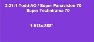
There simply wasn’t any more room in terms of width. And once you’re already wall-to-wall, you can’t make the screen taller and preserve the ratio. I’m confident that Antos’s claim that the overall screen size is 100 percent bigger in square feet is true, not only because there’s no reason to doubt him, but more importantly a claim about square footage is more precise than “twice the size of what what you’re used to.” But, as Allen’s white paper teaches us, raw linear measurements do not always tell the whole story. Even 100 percent bigger does not guarantee optimal subtended screen angles.
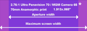
If we look at the range of aspect ratios throughout widescreen cinema history (conveniently collected on one page at the invaluable American WideScreen Museum website), and compare what Antos calls the native aspect ratio for 70mm with Ultra Panavision 70, we begin to see the challenges facing contemporary theaters, even those that regularly project 70mm. Essentially, the only screens that will end up overwhelming you the way the Weinstein Company promo suggests will be those with enough flexibility in masking on the right and left already built in to open up further. (See the image at the top of the cinematography.com discussion linked below, and note that the masking there opens up even beyond the needs of the Ultra Panavision 70 projected image). Without that, it is possible that a first impression might be that the screen is smaller, because it is seems to be less tall, relatively speaking (and especially for those expecting an IMAX type experience).
So why do I still call the Music Box 70mm presentation great? There are still benefits to the 70mm image over the 35mm image, because the former film strip is indeed twice the size of the latter film strip. This has an impact on image quality because the original 65mm camera negative is larger than 35mm. And, oh yeah, we don’t even have the quality of 35mm projection in most theaters anymore.
General audiences do not understand what they’re missing since the industry conversion to DCP. If anyone is disappointed in the image, I blame the “bigger” expectations built up by the Weinsteins, not the actual quality of the 70mm image, which should exceed expectations for those who are now used to DCP.
For one of the most concise descriptions of the benefits of 70mm in The Hateful Eight, I’ll again return to Antos, who has seen his share of 35mm, 70mm, and DCP.
The main thing that sticks in people’s minds is that [70mm] is sharper. There’s more resolution if you’re comparing it to 35mm or a DCP that you’d see in a multiplex. The resolution is somewhere between twice to four times as much, depending on who you talk to, because film works differently than digital. It’s hard to quantify because you’re talking about grain structure versus pixels. On the whole it’s a much sharper format. Additionally, the color and contrast is much greater, deeper and richer. In terms of the way the light hits the screen, it’s more evenly lit, brighter, more intense.
Personally comparing 70mm to what everyone is now used to, DCP, is problematic, even if I end up seeing the film again now that it has opened wide. After just a little research, the closest thing I’ve found to a direct comparison between Hateful Eight images in 70mm and DCP is a description of a special demonstration screening, posted by Tyler Purcel at cinematography.com.
After seeing the test footage, there was a rousing applause. It’s apparent, everyone in the audience was stunned by what we had just seen. However, it wasn’t over yet. The next thing we saw was a DCP version of the material and it really shows how far away digital projection is to film. The blacks were mushy and undefined, the highlights were clearly peaking and the whole image looked flat. All of that beautiful depth seen in the film projection was lost. It was a sad realization this format developed in the 50’s, is still better then all the money we’ve thrown at conventional digital projection.
But for most audiences, that conventional digital projection is just fine. I’ve tried to suggest the beauty and vividness of Richardson’s cinematography in the first part of this review. We might be past a point where discussing that beauty—and why it is beautiful—is relevant for general audiences. That’s not just an issue of changing technologies. That’s about us.